1. Introduction
2. Add Product Property
3. Input Type: Text
4. Input Type: Dropdown
5. Input Type: Radio
6. Input Type: Checkbox
7. Input Type: Attachment
8. Input Type: Radio with Image
9. Input Type: Checkbox with Image
1. Introduction

Product Property allows sellers to offer personalized products and services tailored to customers’ specific needs. With customizable input fields like Text, Dropdown, Radio, Checkbox, Attachments, Radio with Images, and Checkbox with Images, you can easily collect detailed customer information during the purchase process. This ensures that each order is fulfilled exactly according to your customer’s preferences, enhancing satisfaction and creating a more personalized shopping experience.
This feature is available for Add-On only.
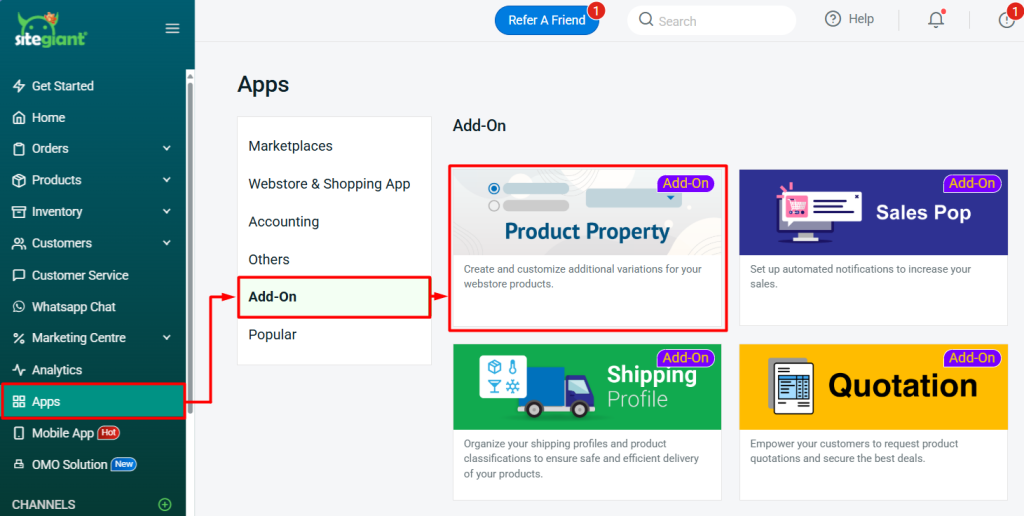
2. Add Product Property
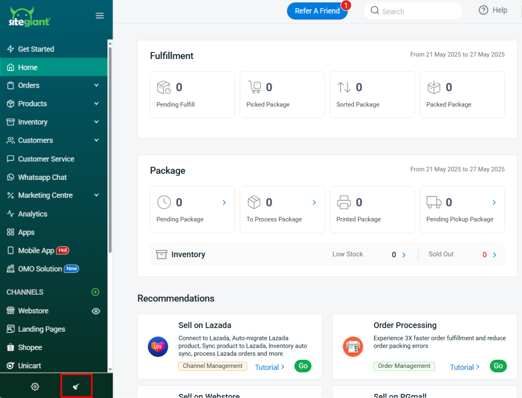
Step 1: Navigate to Apps on the sidebar menu > Add-On > Product Property.
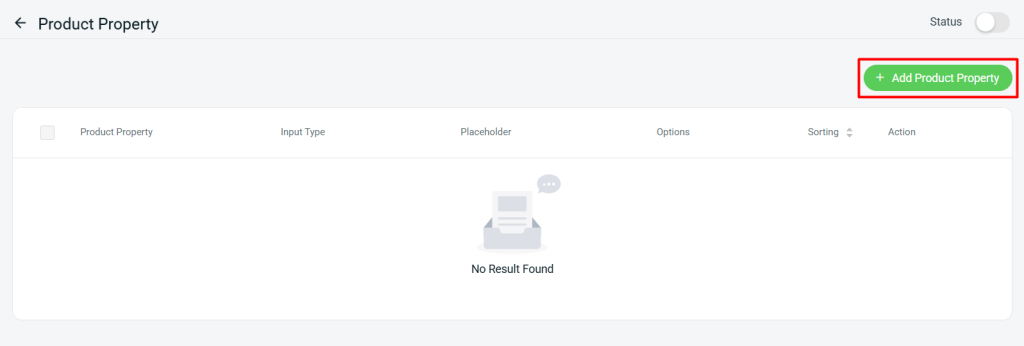
Step 2: Click + Add Product Property.
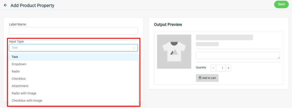
Step 3: Choose Input Type.
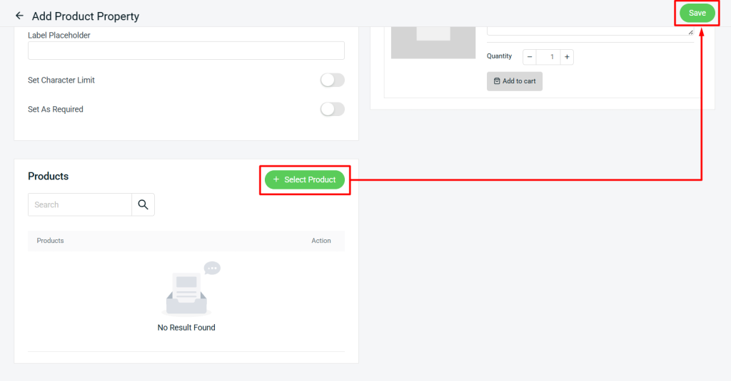
Step 4: Click + Select Product to add product(s) to this input type > Save.
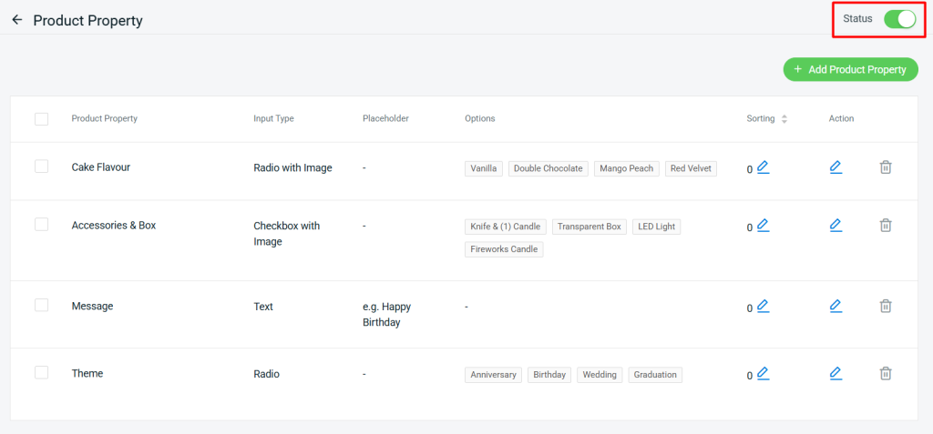
Step 5: Enable the Status to apply the Product Property.
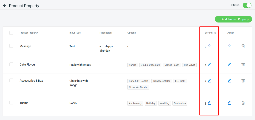
Step 6: You can edit the Sorting of the Product Property display in the Webstore.
Step 7: Back to the dashboard and Clear Cache to see the changes on your Webstore.
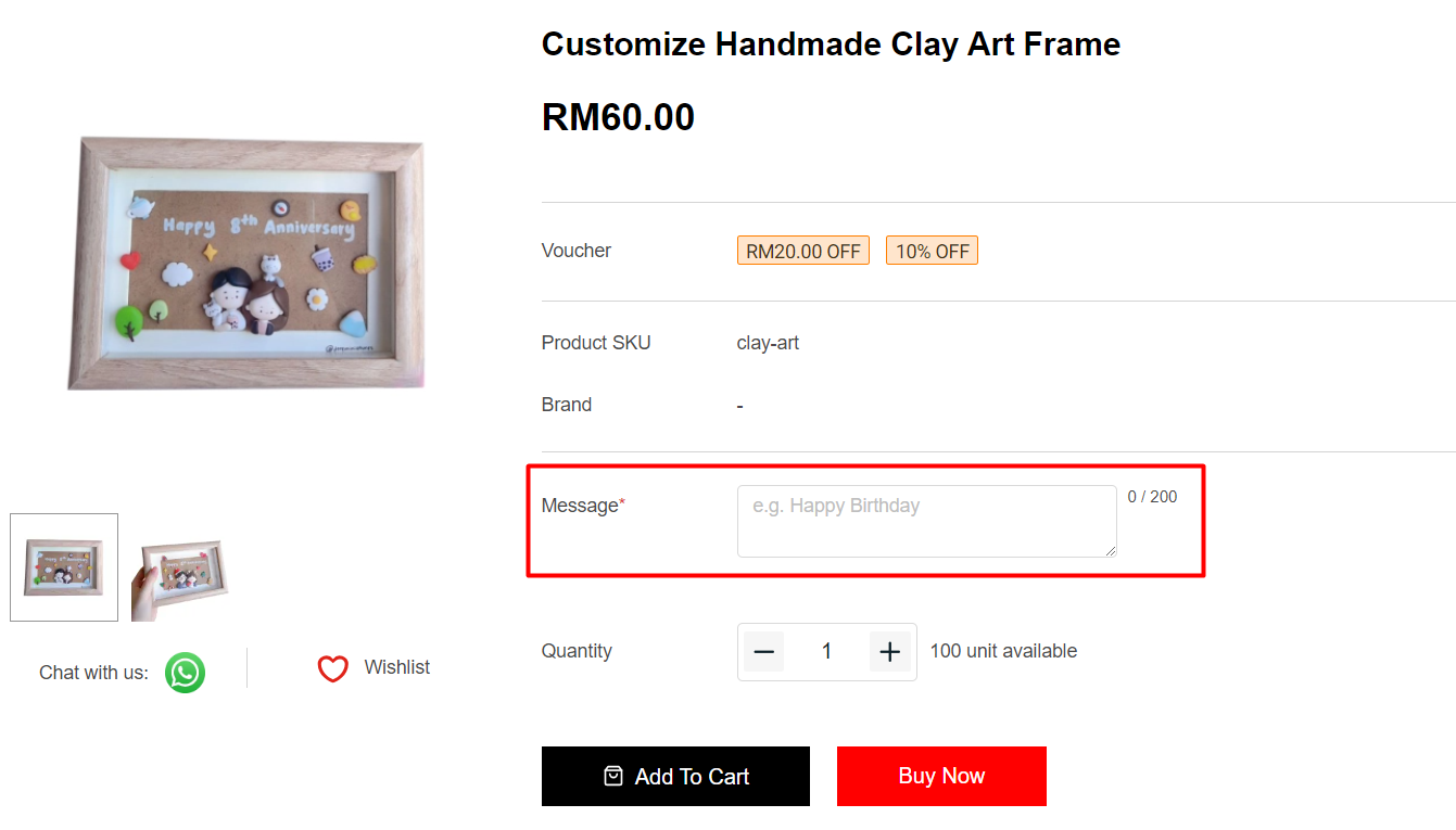
3. Input Type: Text
Text input type allows the customer to leave down their remarks or messages for the product.
Step 1: Fill in the Label Name and Label Placeholder > set Character Limit if you wish to have a limitation on the personalized content > set if it is a Required field for the customer to fill in.
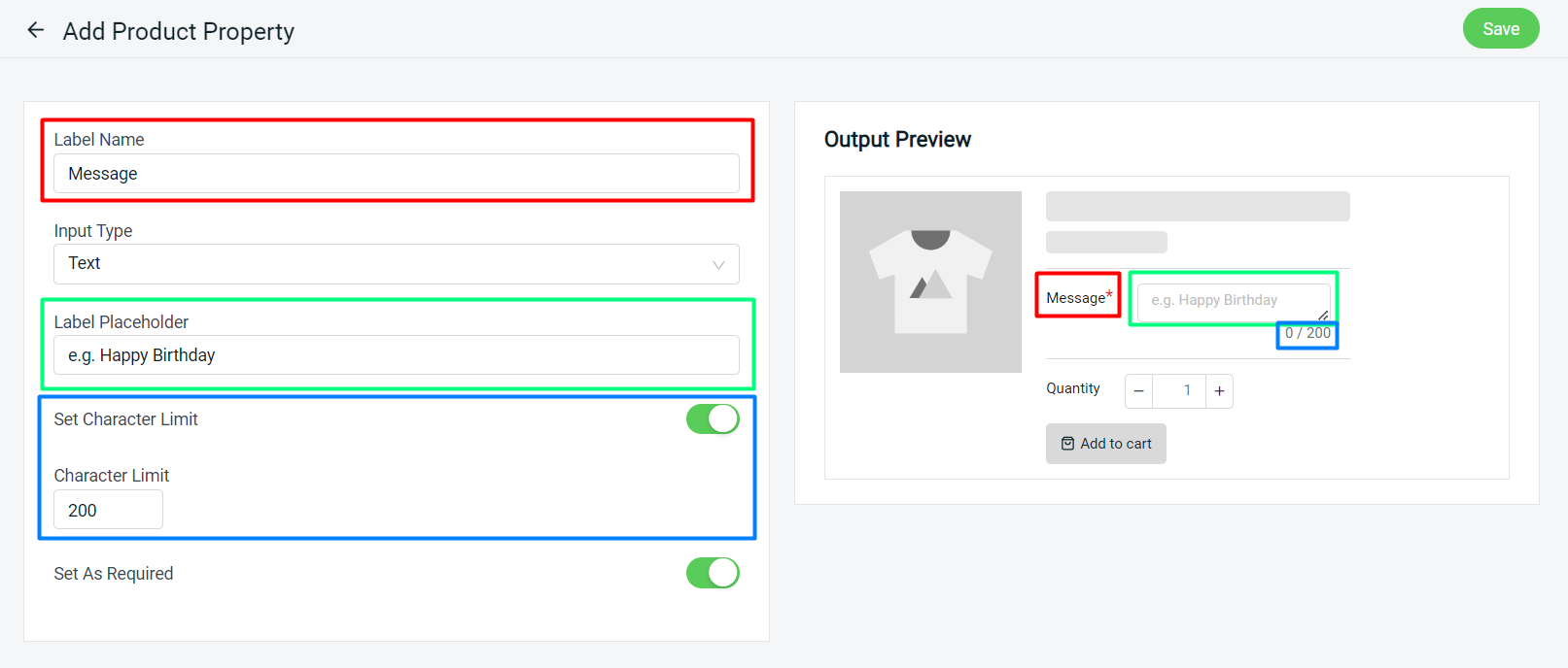
Preview:
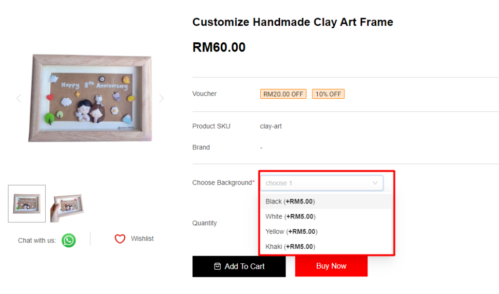
4. Input Type: Dropdown
You can set options for customers to choose from by using the Dropdown input type. Customers can only select 1 option value from the Dropdown input type.
Step 1: Fill in the Label Name and Label Placeholder > fill in the Option Values and set the price > set if it is a Required field for the customer to select.
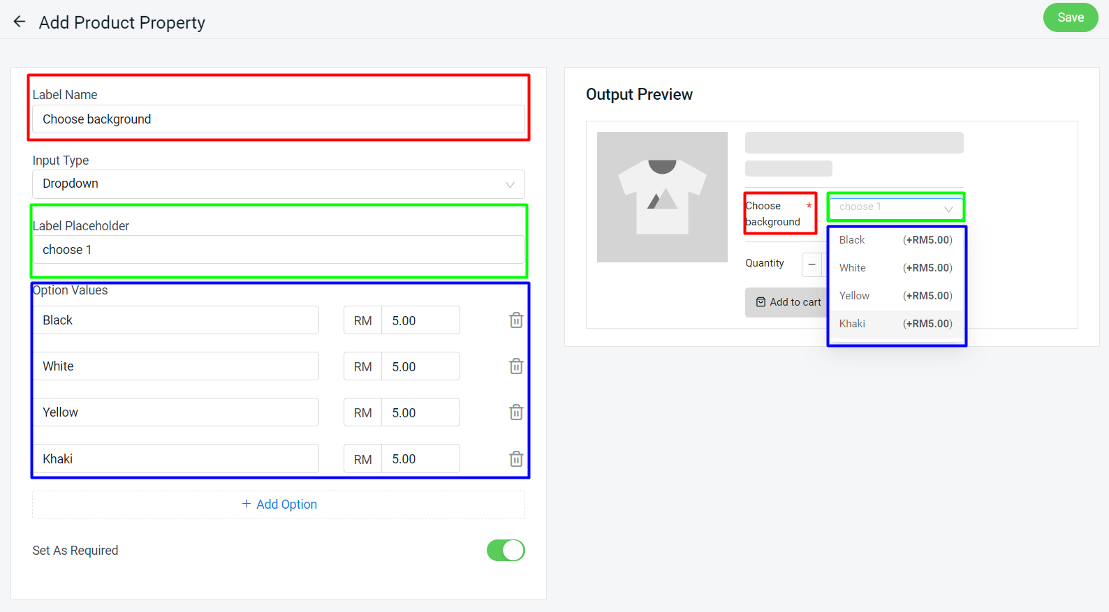
Preview:
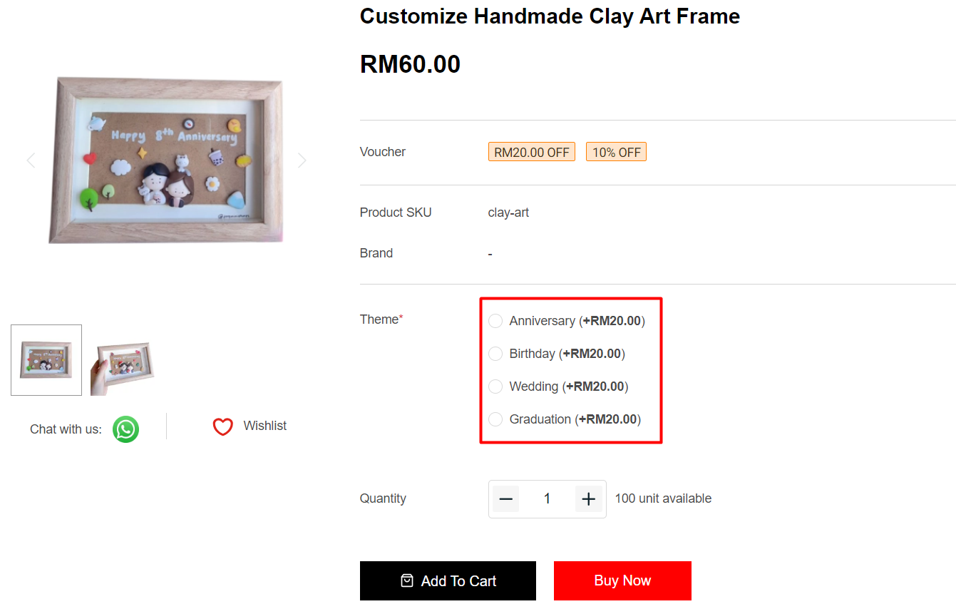
5. Input Type: Radio
Radio input type can let your customers read all the options at a glance and choose. Customers can only select 1 option value from the Radio input type.
Step 1: Fill in the Label Name > fill in the Option Values and set the price > set if it is a Required field for the customer to choose.
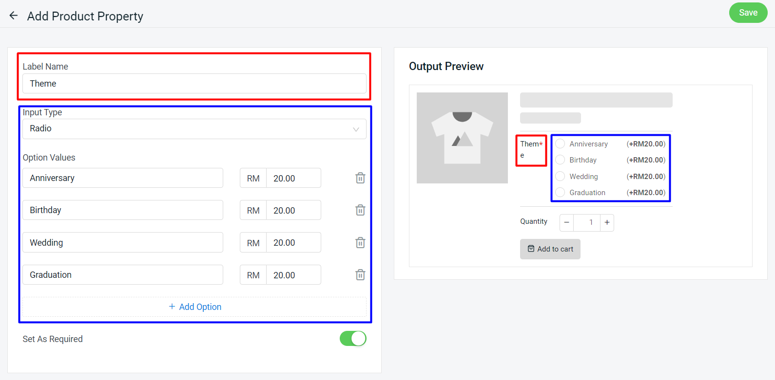
Preview:
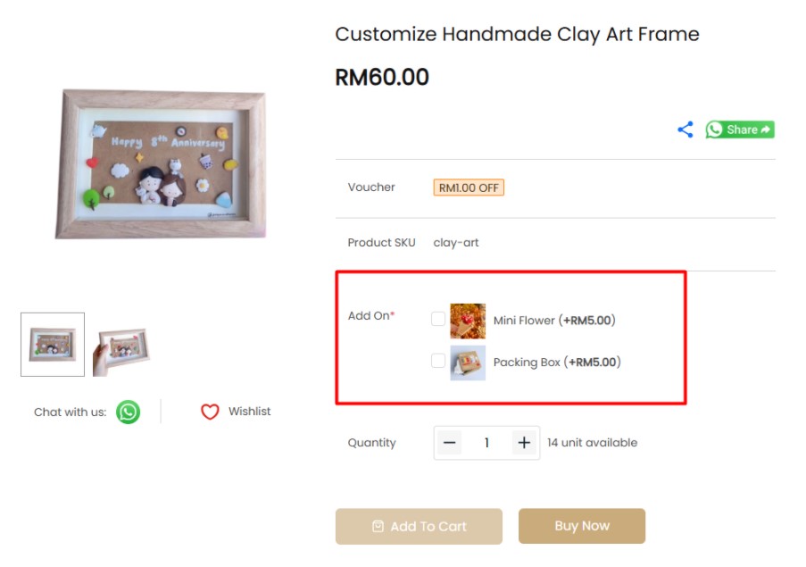
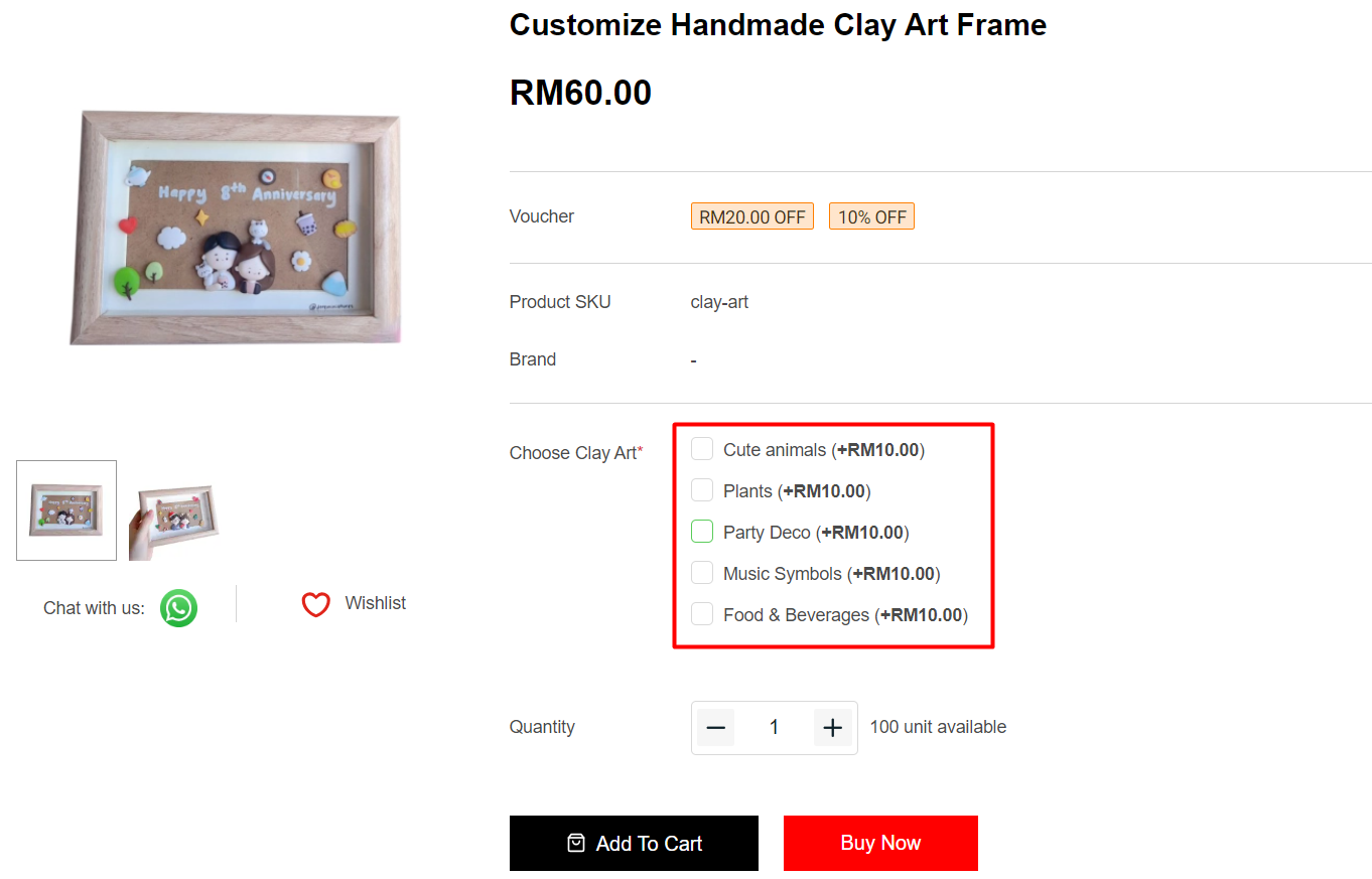
6. Input Type: Checkbox
The checkbox input type is a perfect type to use when you want the customers to be able to select one or more options.
Step 1: Fill in the Label Name > fill in the Option Values and set the price > set if it is a Required field for the customer to choose.
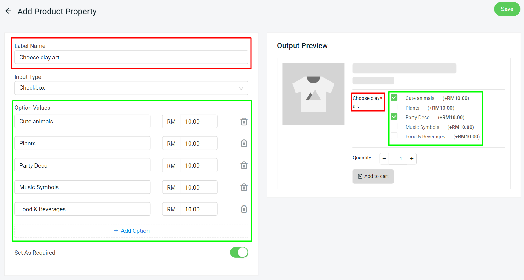
Preview:
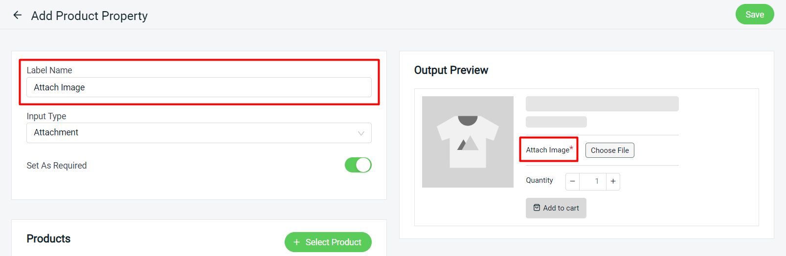
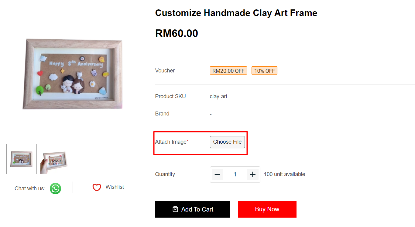
7. Input Type: Attachment
The attachment input type allows customers to upload the image or file for sellers to customize the product.
Step 1: Fill in the Label Name > set if it is a Required field for the customer to upload the file.
📌Note: Only supports JPG, JPEG, PNG and PDF format.
Preview:
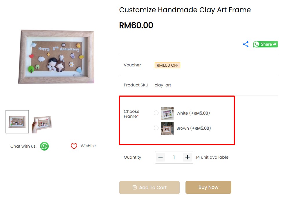
8. Input Type: Radio with Image
Radio with image input type allows customers to view images and select options visually. Customers can only select 1 option value for the Radio with Image input type.
Step 1: Fill in the Label Name > fill in the Option Values with Images, Name, Price, and Image Alt > set if it is a Required field for the customer to choose.
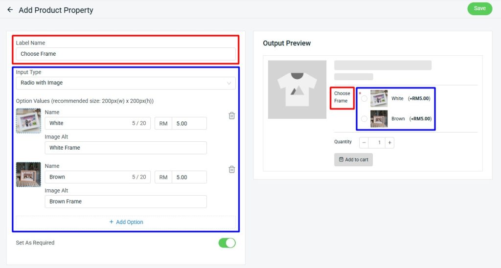
Preview:
9. Input Type: Checkbox with Image
Checkbox with image input type allows customers to visually view the image and select one or more options.
Step 1: Fill in the Label Name > fill in the Option Values with Images, Name, Price, and Image Alt > set if it is a Required field for the customer to choose.
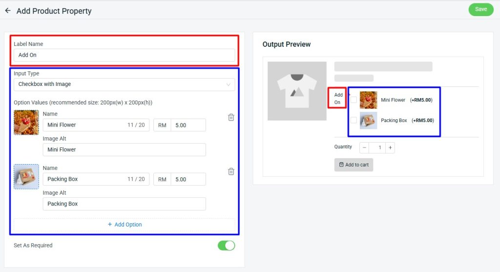
Preview: